Feature Reduction is the method of reducing the number of variables (features) that are reviewed. Dimensionality Reduction is divided into two sub-categories: Feature Selection and Extraction of Features. The second will be addressed.
Features Selection vs. Features Extraction
An understanding of the difference between feature selection from feature extraction may be, for instance, that we can use the following equation:
a+ b + c + d = e
Suppose a, b, c, and d are the independent features, while e is the variable of interest and we need to decrease the number of independent features. This can be accomplished by using two methods.
The first step is equating ab = a + b and then utilizing ab to signify two variables, thereby making the equation appear like ab + c + d = e. This is the way feature extraction works. But, if the value of d is ‘0’ or is a tiny number, making it unimportant in the equation, it could be removed, causing the equation to appear to be a + b + c = e. This is how feature selection works since
we choose only those features that have relevance to our ‘equation which is why we eliminate non-relevant aspects.There is a variety of feature extraction, such as the Principal Component Analysis (also known as PCA, which is an unsupervised algorithm for learning), Kernel PCA, Linear Discriminant Analysis (LDA), Independent component analysis, etc.
This blog post will focus on PCA.
Principal Component Analysis Overview
Before going into the intricacies and the nitty-gritty of the entire procedure of the PCA, Let’s first get an idea of how it’s functioning. Imagine that we have a data set with various car characteristics. They are distinct features. As the dependent variable is the cost for the vehicle (several variables) or an automobile’s name (a categorical variable). These distinct features are grouped into groups that are extremely similar to one another. Some features related to the dimensions of the car, for instance, how big the tire is, clearance of the ground as well as the size of the car’s roof, and the overall dimensions of the car overall height of the vehicle and can also be linked to each other, for instance, that the dimensions of the tires may be extremely correlated with the ground clearance and thus do not provide many details.
Additionally, other types of features are possible. If the database contains hundreds of these features, which is the case, it can be difficult to discern these types of groups because we are unable to see the distinctions from a distance. To identify the groups, for example, we make scatter plots with two variables, the vehicle’s weight and height. We find that both of these factors are positively associated with certain cars that have a very strong correlation (higher height, and therefore heavier), and some cars have a lower correlation (high height but no weight). However, when taken on a general basis, both variables have an increase in correlation. A positive correlation will basically indicate that they are showing similar things. A negative correlation (for example, in the instances of engine size and mileage, wherein with growth in size, your mileage decreases) could mean that the two variables are comparable, however differently.
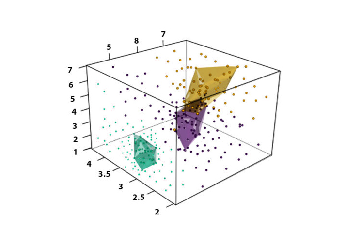
Suppose we need to study a particular parameter. In that case, it can be accomplished using a basic line in which data points be placed on a line, and we can clearly discern the points of data that are distinct from each other and how the data points impact a dependent variable. If we need to determine the connection between two data points, it’s a problem in 2-D (2-D). We could use a scatterplot, where either the height or Y (vertical) is the axis that could represent one variable. In contrast, the breadth or X (horizontal) axis may represent another variable. When we look at it, we can see if these variables are connected; if you could determine the relationship between three variables, we can employ a more elaborate 3-D graph, with depth being the third axis that is used to represent the third variable. However, it will create problems for us since analyzing such graphs will be very challenging as it will be necessary to rotate the graph to discover relationships between the details.
Data Points in 3-Dimensional Space
If we are to analyze multiple variables simultaneously, we must create a graph with an axis for every feature that is not considered by a human brain.
At present, there are two options when we need to discover connections between, say, 100 variables. One is to create thousands of 2-D plots or ridiculous plot that is not understood by the human brain. The answer to this problem is PCA. You can make a PCA plot that transforms the connections or the absence of correlations between the features into a 2-D graph that groups those strongly related features. In this case, we might find certain groups of features that we can categorize into ‘Dimensions for the Car,’ Performance Of Car Power of Car’, and so on.
In other ways, features that don’t offer much information are removed, i.e., If two elements have been heavily dependent, we may eliminate one of them.
However, if the features aren’t statistically distinct, a single feature may,
in effect, represent a mix of various types of information with one value. To better understand this, we will look at an illustration of image classification in which we utilize the blue, green, and red parts of each pixel of an image to determine the classification of the image. The process involves the capture of the information by various image sensors. Sensors that are most sensitive to the red light can capture that color. However, they also capture green and blue light.
In the same way, sensors that are most sensitive to green and blue light also have a degree of sensitivity toward red light. Therefore it is true that sensors that are sensitive to green and blue light also have a certain degree of sensitivity. R, G, and B components are, in essence, interconnected, but it’s not difficult to comprehend that, even though they’re interconnected, each one is vital and offers details. No feature can be eliminated in the same way. If we eliminate one of the components, such as the Red part, we remove all information regarding both the G and B channels. Therefore, in order to eliminate features, we are not able to simply remove redundant features. Still, we need to change the feature space to ensure that the features that are not correlated are obtained. PCA utilizes this type of correlation to transform data into a different space with uncorrelated dimensions by linearly combining the initial dimensions, resulting in a distinct set of attributes, and a linear mixture of the input features. This is accomplished by turning the coordinate systems in to ensure that these new dimensions are independent and only represent the various and distinct features of the data. Principal Component Analysis thus reduces the larger vector spaces into smaller order by
compressing projections of the dimensions, making visualization simple when we have data in three dimensions (for example, R G, B component); PCA converts it into two dimensions by locating the plane that carries the most of the data. The data is projected on a new axis and results in a reduction in dimensions. When components’ projections occur, a new axis is constructed to define the relationship. they are referred to as the principal axis. These components that are created are called principal components. The new dimensions are provided with a score from PCA, with higher dimensions having an abundance of data but with smaller reductions in the dimension. It is less dimensional with a smaller amount of data since data is contained in an enclosed area, making it difficult to distinguish different data samples; however, it reduces the size of the data to the greatest degree.
PCA Detail
First, we need to think about the size of a dataset. For instance, let’s say we have a data set with the car’s name as a dependent variable. However, the independent variable holds diverse information about the car. We would have to narrow the size of the information.

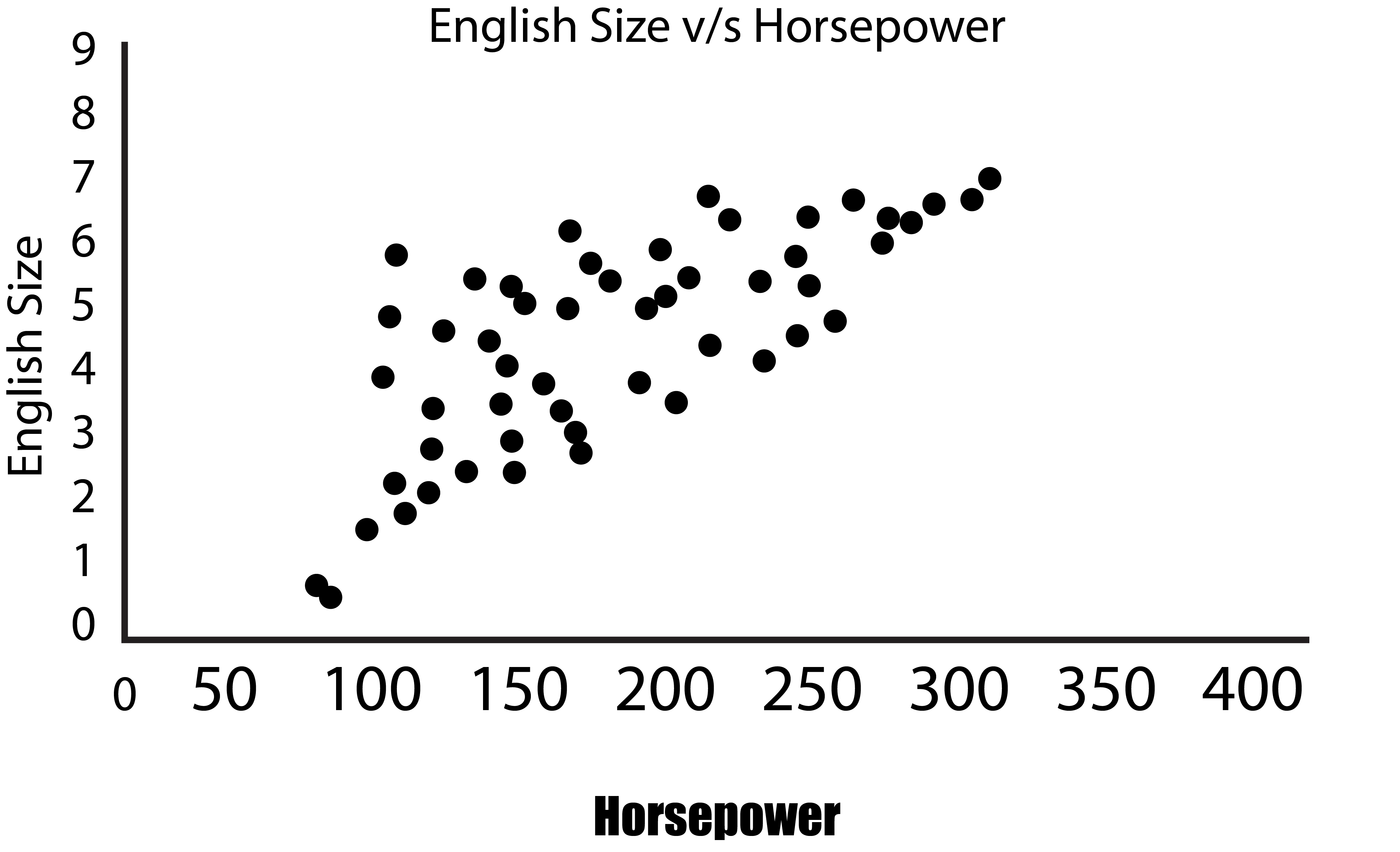
It is possible to create a one-dimensional plot, which is basically a line of numbers where we can only consider one variable. This is of no use in reducing the features. It is possible to create a 2-D graph with two axes and draw data from two variables. We will use Engine Size in addition to Horsepower and see that they share a positive co-linear relationship.
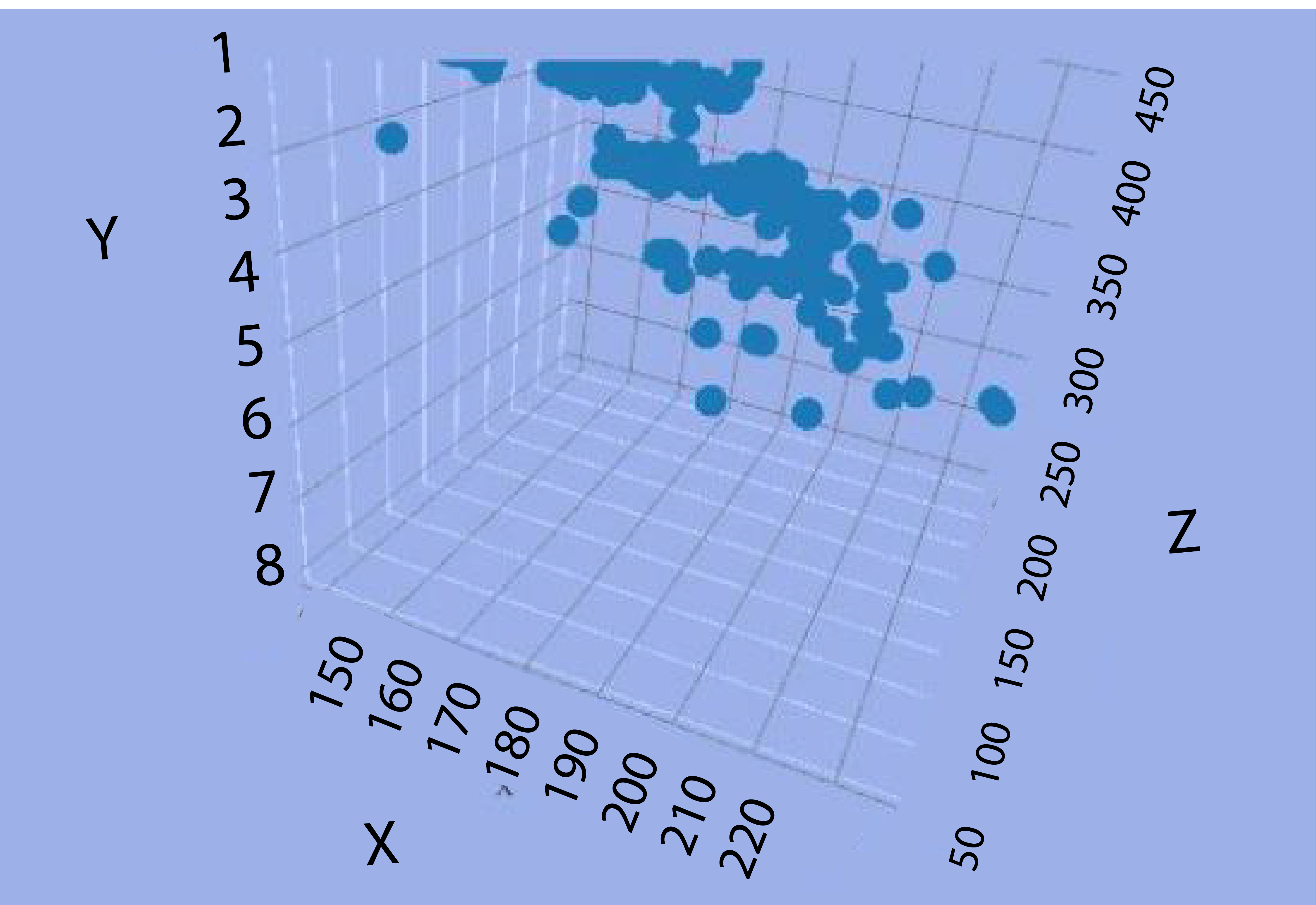
Suppose we need to make an illustration of three variables like Length, Engine Size, and Horsepower. In that case, we will be required to construct a 3-D graph, which will then be needed to be rotated continuously to discover the connections (which isn’t easy).
The X axis is for length, while Y is the engine’s Size, and Horsepower is displayed by the Z axis (Depth).
If we are trying to determine the connections between these three variables, we’ll have to draw lines parallel to each axis of each data point to figure out the points where they meet. We will do this for all observations to come to a conclusion. This fancy graph is not of much help to us.
To discover relationships between four or more variables, the plot will not be of much help.
For instance, we’ve got hundreds of features, and we need to identify those features that are the most essential to comprehend how PCA can assist in the reduction of hundreds of features; let us take the simpler case where there are two features, and we need to reduce them without losing any of the variables, i.e., minimizing the loss of information. If in our 2-D graph (having two variables), there is the most variation in one feature, and the other feature is characterized by smaller variation. The difference in the data may be described as being from the left and right.
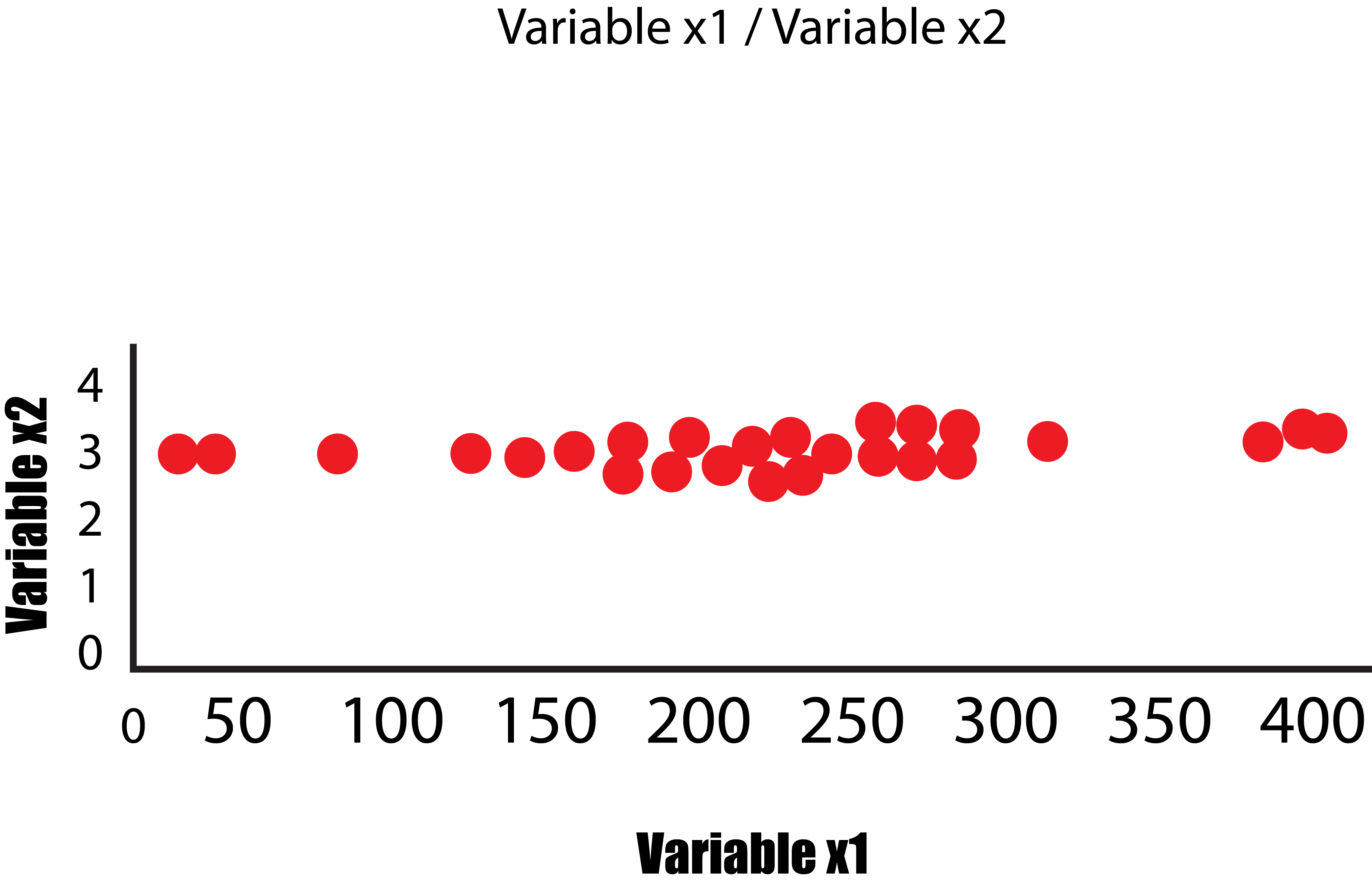
In this instance, only the variable x1 has a variance, and the variable x2 has a lower variance. If we eliminate the small variance in the x2 variable, we’ll get a graph that will look like the one in the below image and, as such, could be represented as the 1-Dimensional graph ( a line of numbers). This is how we transformed 2-Dimensional data into 1-Dimensional data without losing any information (as a result of this information, we refer to the variance as flattened) since in both graphs; it is clear that the main variation is from the left side to the right, i.e., the axis that the variable x1 is plotted, thus answering the question as to which variable is more important. In this case, the variable x1 has greater significance.
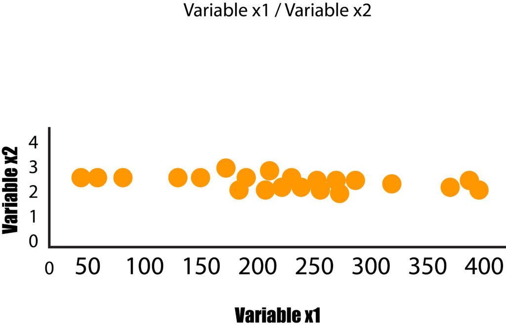
Each feature thus is a dimension that adds another; however, each one of these dimensions has distinct variances, which means that certain dimensions are more significant than others. PCA operates similarly when it collects data from many dimensions and then flattens it into smaller dimensions (2 Dimensions for visualization) by finding effective ways to reduce the data size, focussing on the aspects that differ between the aspects.
Going back to our previous instance in the form of Engine Size and Horsepower, we can observe that our data points are scattered across the diagonal line. The most variance in the data is found by identifying the two extreme points of this feature (Horsepower). But the dots are distributed over this line, and the variance is due to the variable’s weight as we can see that the variance isn’t too high when we look at the two extreme features.
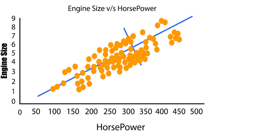
Note: When the extreme value to the right increases the variance in this case, it might be due to the value as an outlier. This is why outliers should be eliminated, or the data should be standardized to reduce the effects of extreme values.
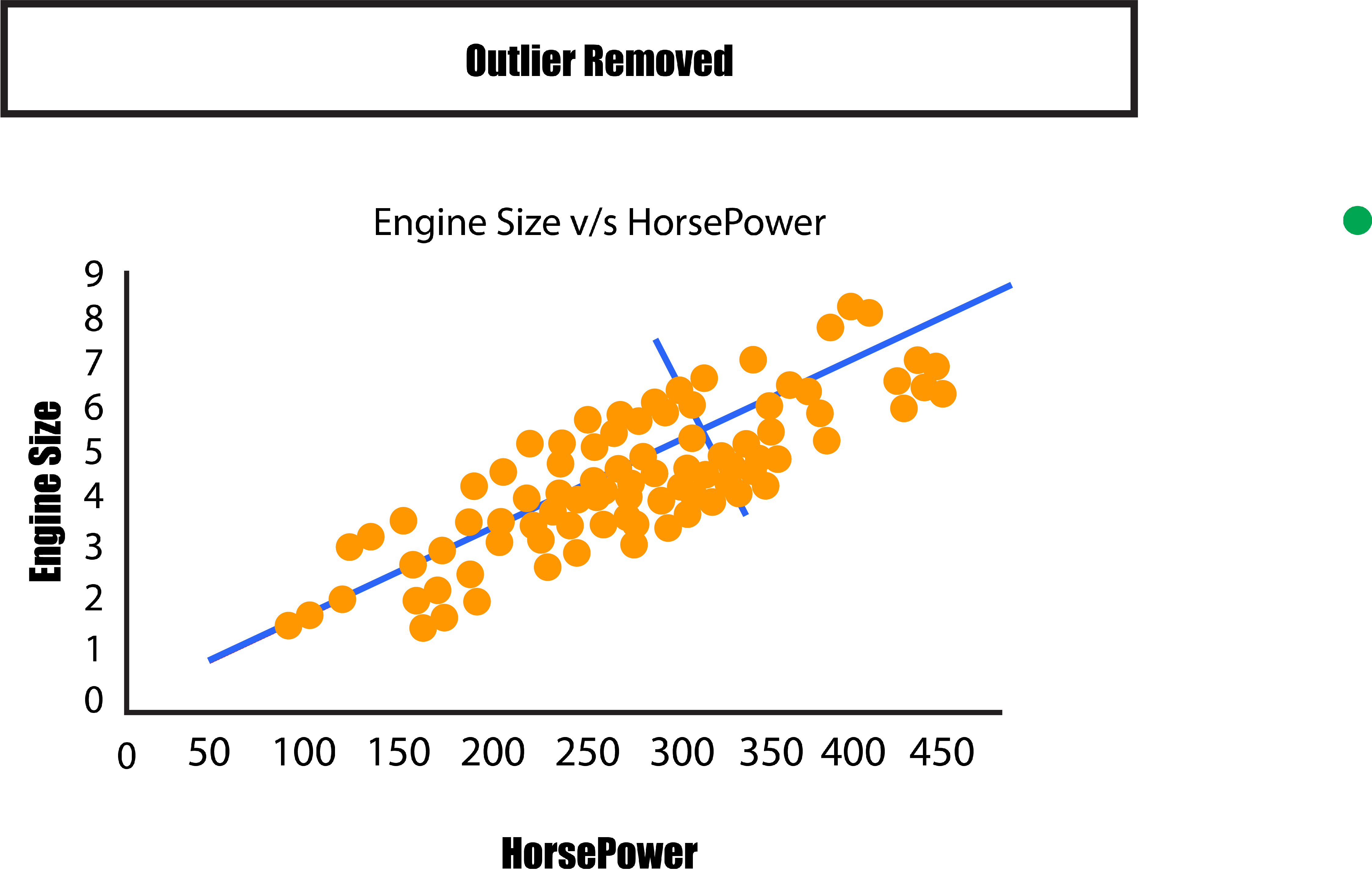
We can compare the current situation to the previous one in which we saw a variance on the X and Y axes. We need to turn the graph to make the two lines parallel to the X and the axis. This helps us understand the differences between these lines.
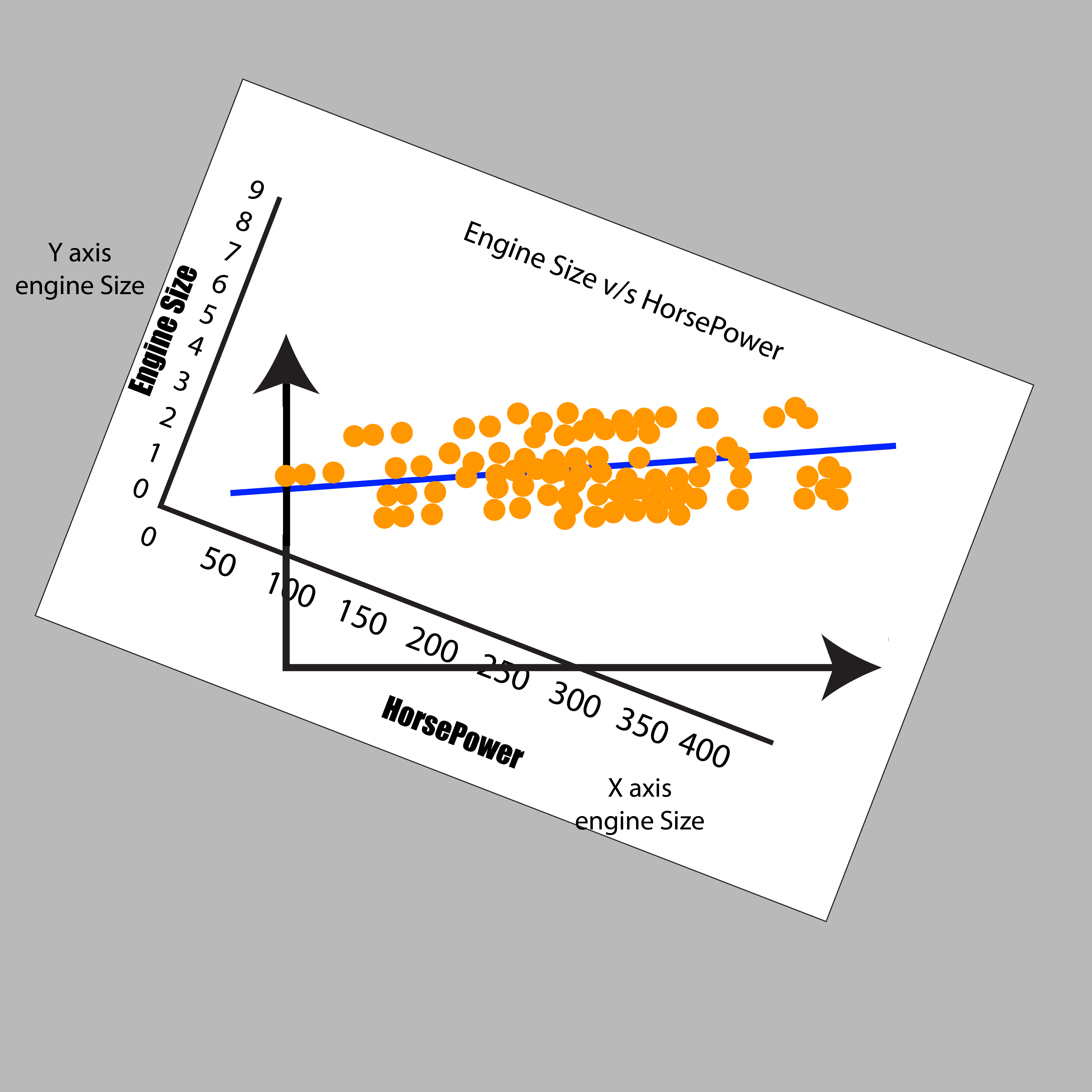
It is now possible to sketch the variance in terms left and right, as also as up and down. The two new axes rotate to depict the variations in the data. They are referred to as Principal Components. One with the greatest variation in the dataset (variation between left and right) is the first Principal Component, and the other one has lower variations (top from bottom). Therefore, from both directions, we can determine the greatest amount of variation based on the numbers.
Suppose we were to have three elements in our question. In that case, we’d be able to see three directions, which generally means that we’d have three principal components each for a particular variable. The same process is followed for five, six variables, etc., including Principal Component 1 being the one that spans in the direction with the most variation and Principal Component 2, which spans in the direction with the second-highest variation, and further on. If we have 100 variables, we’ll have 100 principal components. It is important to remember that these axes are placed by importance in order, with PC1 being the one most
important, PC2 being the second most significant, and so on.
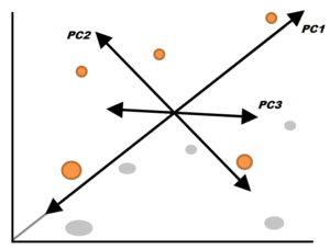
So, in our data, when we have 64 variables, that means there are 64 dimensions. We will end up having 64 Principal Components. However, we’d like our information to be compressed to 2 dimensions, using the information from two primary components. But, by using just two of the components, we are losing many of the information that could have been useful in identifying or forecasting the variables we want to target. So, if we employ just two components, compressing all of our variables into two dimensions and then projecting our target variables, the variables we target will appear extremely cluttered and may not be properly separated. Still, it becomes easier for us to understand such graphs. In addition to its loss of information, PCA has additional disadvantages; for instance, it can result in linear relationships between different variables, which is not always desirable.
Despite its pros and cons, Principal Component Analysis is still the most well-known and widely utilized method for Feature Reduction. In terms of feature extraction, PCA can be the best and most commonly employed method and should be utilized for datasets with very large dimensions.
